

The Firefly Animation Debate:
Which Style Will Keep the ‘Verse Feeling Real?
*** ADD YOUR VOTE ON YOUR FAVORITE STYLE AT THE BOTTOM OF THE POST ***
The Firefly animated revival is finally happening, and one of the biggest questions swirling around the Browncoat community right now is: What style of animation should this new series use? With the project in advanced development at ShadowMachine (the studio behind BoJack Horseman, Guillermo del Toro’s Pinocchio, and Robot Chicken), early concept art has surfaced, and fan speculation is in overdrive. The original live-action Firefly had a gritty, lived-in, almost documentary feel—handheld cameras, practical sets, and that signature “used future” aesthetic. Animation has to capture that essence without losing the soul of the ‘verse.
Here’s a deep dive into the options, what we’ve seen so far, what fans are saying, and my take on the style that would best honor the show while making the most of the medium.
What We Know from Official Sources and Concept Art
- ShadowMachine is handling animation. This studio excels at adult-oriented, character-driven work with a range of styles: stop-motion (Pinocchio), stylized 2D (BoJack), and edgier, irreverent stuff (Robot Chicken). They’re not locked into one look, but their portfolio leans toward expressive, high-quality animation that prioritizes performance and emotion over hyper-realism.
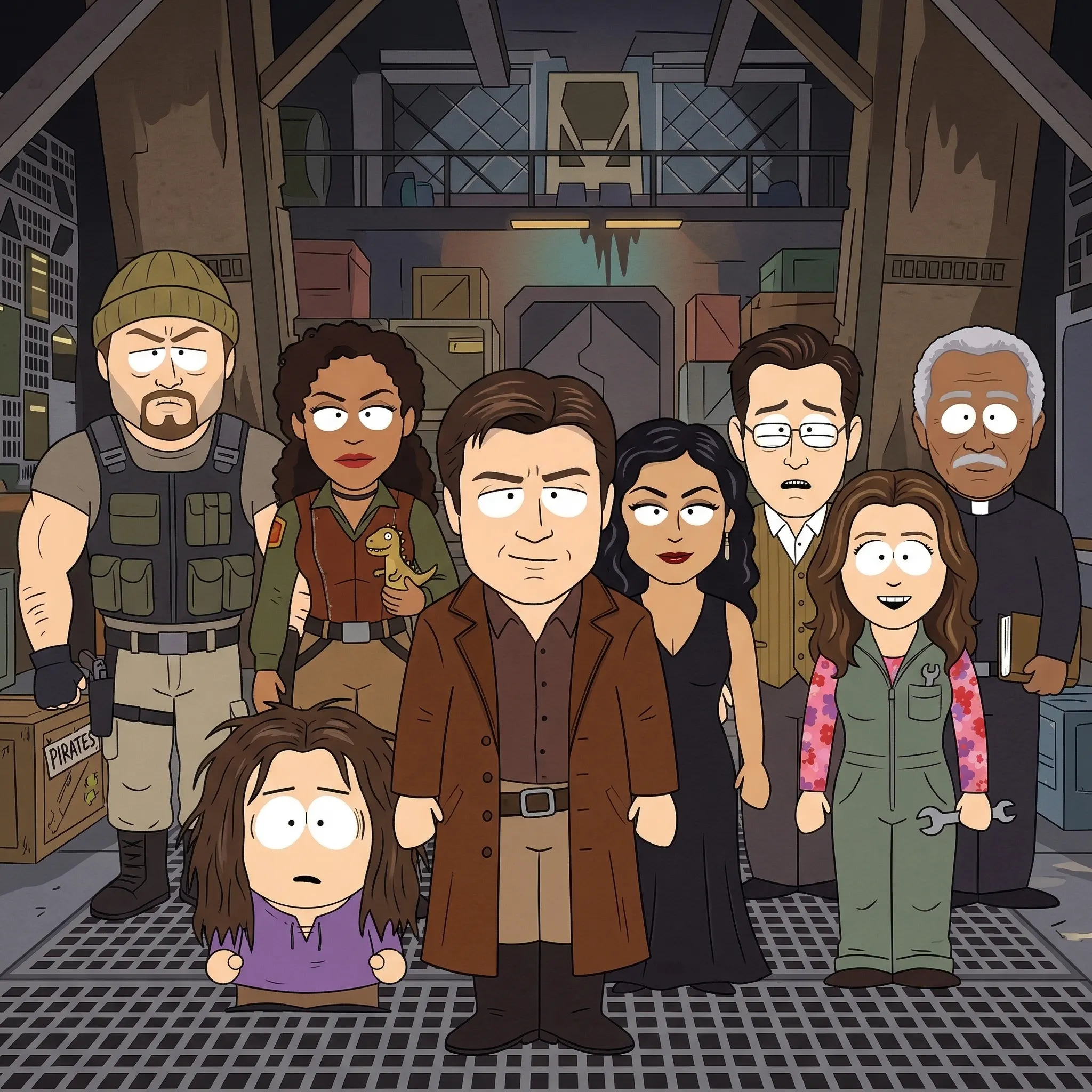
- Early concept art (shared via Deadline, Hollywood Reporter, and fan posts) shows character designs that look fairly realistic—detailed faces, grounded proportions, and a lineup that feels like stylized versions of the original actors. It’s not ultra-cartoony; it has a semi-realistic edge with clean lines and subtle shading. Some fans describe it as “gritty and more realistic,” while others note it resembles storyboards that might evolve into something polished.
- The series is set in the “Wash is still alive” era (pre-Serenity), so the goal is to recapture the original crew’s dynamics without de-aging tech or recasts feeling off.
No final style has been locked in—it’s still development—but the art points toward something more grounded than exaggerated cartooning.
Popular Fan-Suggested Styles (and Why They Fit—or Don’t)
Browncoats have been dreaming about this for years, and Reddit threads, Facebook groups, and TikTok discussions highlight a few frontrunners:
- Anime-Inspired (Cowboy Bebop Vibes) Many fans push for a 2D anime style like Cowboy Bebop or Outlaw Star—fluid action, expressive faces, and a cool, retro-futuristic polish. It matches the space-western hybrid perfectly: bounty hunters, moral ambiguity, jazz-infused vibes. The “rough around the edges” feel could come from hand-drawn imperfections. Pros: Iconic for adult sci-fi anime; great for dynamic ship chases and gunfights. Cons: Might feel too stylized for Firefly‘s grounded, Western grit—less “lived-in” dustbowl planets, more sleek neon.
- Realistic 2D or 3D (Arcane / What If…? Style) A semi-realistic approach with detailed textures, cinematic lighting, and actor-like proportions (think Arcane or Marvel’s What If…?). This preserves the original cast’s likenesses and the “documentary” camera work from the live-action show. Pros: Captures the tactile, worn feel of Serenity; space battles could feel weighty and real. Cons: More expensive and time-intensive; risks looking like uncanny-valley CGI if not done right.
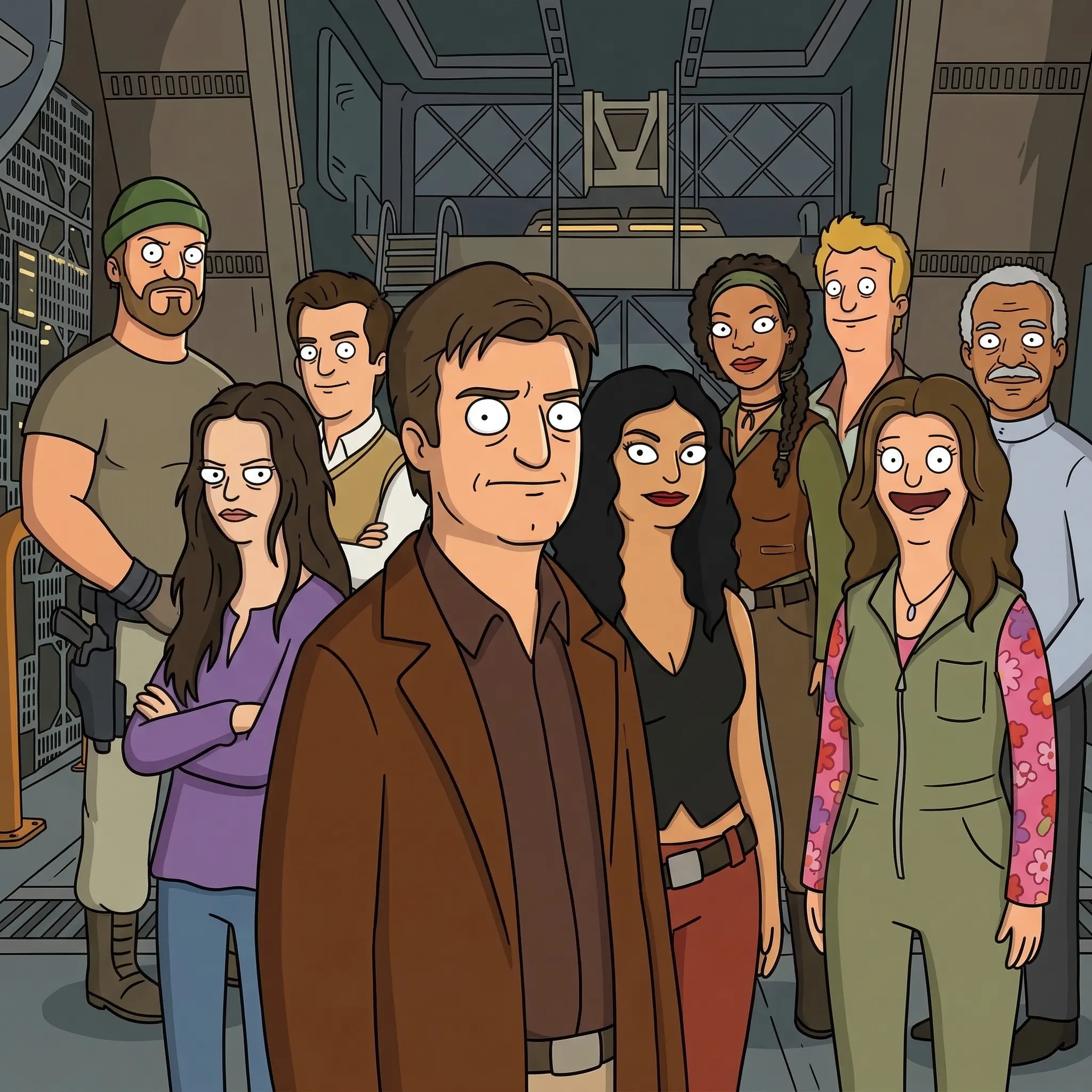
- Hand-Drawn 2D with Gritty, Rough Edges (90s Warner Bros. / Adult Swim Influence) Old-school 2D with imperfect lines, muted colors, and a handcrafted look—evoking Cowboy Bebop meets The Venture Bros. or early Adult Swim. Pros: Affordable, expressive for humor and heart; emphasizes character over photorealism. Cons: Could feel too “cartoony” for fans who want the lived-in authenticity.
- Stop-Motion or Hybrid ShadowMachine’s stop-motion expertise (Pinocchio) could bring a tactile, artisanal quality to props and ships. Pros: Unique texture that mirrors the practical sets of the original. Cons: Slow production; hard to scale for weekly episodes or fast action.
Fans are split—some insist live-action texture is irreplaceable and animation will always feel like a compromise, while others celebrate it as the best way to reunite the cast and tell new stories without aging issues.
My Recommendation: Semi-Realistic 2D with a Handheld, Cinematic Edge
The winning style should blend realism for character authenticity with stylized grit to keep the Western soul alive.
- 2D animation (likely with some 3D elements for ships/space) to allow fluid motion, expressive acting from the voice cast, and budget-friendly production.
- Detailed, lived-in designs —rusty hulls, patched clothes, dusty frontier planets—but with clean, modern line work so it doesn’t look dated.
- Cinematic techniques —handheld “camera” shakes in action scenes, wide Western vistas, dramatic lighting—to echo the original’s grounded feel.
- Muted, earthy color palette with pops of color (Inara’s silks, engine glow) to maintain the contrast between Core worlds and Rim dirt.
This approach plays to ShadowMachine’s strengths in adult storytelling and performance-driven animation. It lets the voices (Nathan Fillion, Alan Tudyk, etc.) shine without uncanny de-aging, while expanding the ‘verse—more Reavers, Alliance intrigue, heists—without being shackled to live-action constraints.
Animation isn’t a downgrade; it’s liberation. It can do things live-action never could: bigger space battles, weirder planets, deeper visual metaphors for River’s mind. Done right, this could feel like the Season 2 Firefly always deserved.
What do you think, Browncoats? Anime polish? Gritty realism? Something else entirely? Drop your ideal style in the comments—maybe the team is still listening. Let’s keep the ‘verse flying.
You might Like These..


ADD YOUR VOTE ON YOUR FAVORITE STYLE BELOW

Family Guy
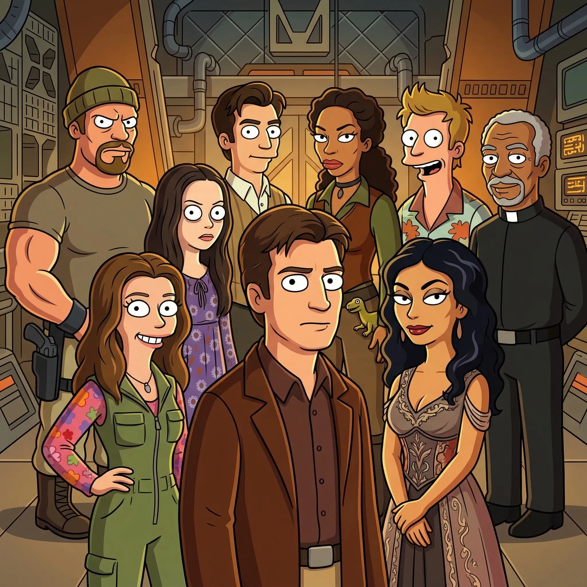
South Park
Futurerama
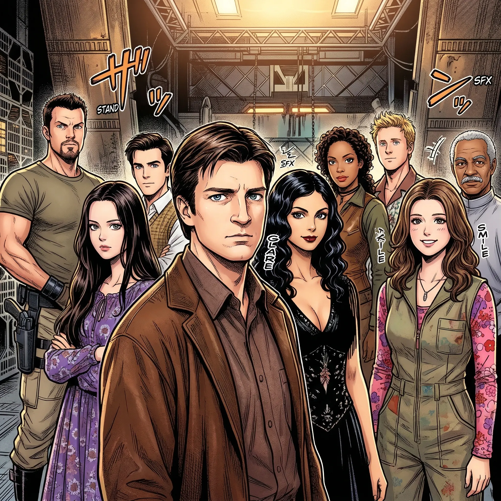
Anime

Trump Administration
Bob’s Burgers
The Simpsons
Cartoon

Ren & Stimpy